It's time for a refresh!
How time has flown! It wasn’t long ago (only 24 months!) that our co-founders Dan Hobbs and Ciaran O’Mara created Protex AI with a simple mission: to help EHS teams to revolutionize how they make proactive safety decisions that lead to safer work environments. Two years may not seem like much, but in the hyper-growth world of startups, it can be perceived as a long time.
In those two years, a lot has happened. Last year, we raised an impressive $18 million round of investment, backed by some of world's top VC firms. Our team is now 40 strong, with plans to grow even further across all functions of the business throughout 2023 and beyond. Also, we’ve begun partnerships with global enterprise companies such as DHL, Proctor & Gamble and M&S.
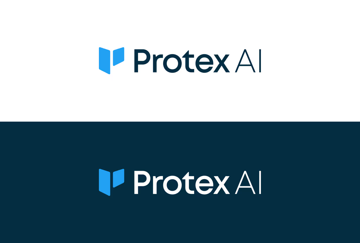
As you can see, we’re growing up - and we wanted our brand logo to reflect this. That’s why, in recent months, a team of designers, content creators, marketers, and developers have been working hard to bring a fresh look to the Protex AI brand logo, which we are delighted to unveil this week. Here’s the story behind our brand logo refresh.
Our new logo
At the center of our logo refresh is a rethinking of the Protex logo. We didn’t want a complete redesign. After all, we loved the old logo – it was memorable and represented an evolution of workflows. But we believed that there was room for improvement in order to convey our mission statement in a more meaningful manner.

Our new logo is an amalgamation of 3 core elements…
.avif)
Heart
The heart represents the compassionate, human-orientated element of an empathetic EHS professional. The inherent love for helping their colleagues get home safe to their families and friends after a hard days work is imperative.
Shield
The shield represents protection, and exudes the passion EHS professionals have to proactively improve their processes, workflows and training programs that help their wider safety team to provide a safer work environment.
Wings
The wings represent coverage, and the ability to provide clear and simple visibility to areas of risk across an organization's facilities, which is an aspiration for many EHS professionals across the globe.
We have chosen light blue as our primary logo colour. Light blue is associated with trustworthiness and reliability, synonymous attributes recognised within the EHS industry. We’ve also chosen to utilize the same light blue and font from our past logo. This was prioritized in order to keep a level of consistency and familiarity with our old logo.

Whats next?
The refreshed logo is part of a broader brand system that we’re looking to launch over the next few months. This system consists of a revision to our brand guidelines around our tone of voice, a fresh illustration style, and new typography and brand elements. This will help us communicate in a way that is distinctly Protex AI, guided by our desire to help revolutionize how EHS teams create safer work environments.
Check Out Our Industry
Leading Blog Content
EHSQ industry insights, 3rd Gen EHSQ AI-powered technology opinions & company updates.

.jpg)

.avif)